AntSeatr
UI/UX Design Case //2o20
PROJECT
MY ROLE
Design at UCI is a community for designers of all skill levels and backgrounds to innovate, create, and grow. The club hosted project teams where students were divided into groups of 5 and had 8 weeks to come up with and design a product prototype. My team decided to create AntSeatr, an app that locates vacant seats on UC Irvine's campus.
Assigned as the team's project lead, I constructed an 8-week timeline, set milestone dates, and delegated tasks to 4 UI/UX designers. I prepared pitch decks and presented them during our weekly meetings to maintain a cohesive vision, keep track of progress, and discuss any concerns. Prior to this project, I had zero UI/UX design experience. As much as I was guiding the team, I was also learning about the design process from my team members and was hands-on throughout the process. I learned how to use design tools and how to conduct user interviews, testing, and surveys.
PROBLEM STATEMENT
Students waste time walking around campus, struggling to find a place to study in UCI's overcrowded study area.
OUR SOLUTION
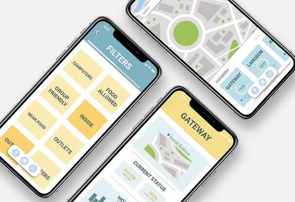
A mobile app that indicates how busy study location on campus are and how many vacant seats are open in real-time.
GOAL
Help students quickly find open study seats on campus.


RESEARCH METHODS
We recruited participants from UCI Facebook groups, UCI Subreddits, and in-person announcements.
User Surveys & Interviews
Prototype Testing
Market Research Analysis
KEY FOCUS AREAS
1.
Where do students study?
When do students study?
2.
3.
What do students look for in a study area?
KEY FINDINGS
1.
Students don't know all the study areas on campus.
2.
Students find it hard to find study areas that meet their needs.
3.
Students don't have a lot of time to look around for a seat to study.
JOURNEY MAPS
Using this research, we constructed a journey map that represents the current process students use to locate a study seat at UCI.

Following our user interviews, we created a second journey map to represent how our product improves that process.

SKETCHES
We explored different information architectures, card vs list designs, and other design aspects.


WIREFRAMES
After experimenting with our sketches, we decided to use a card design. We wanted AntSeatr's design to be friendly, fun, and simple to uplift our users and ease their stress.
Light blue is a calming color and blue is associated with trustworthiness and reliability.
Yellow is uplifting, cheerful, and fun.
FINAL DESIGN


